Justworks Time Tracking Mobile App
Driving innovation in the affiliate commerce content space by fostering intent-driven shopping behavior.
As the first designer on the team, I led the efforts on a more efficient time-tracking experience for our worksite employees, in support of our vertical expansion initiative.
Role
Product Design, User Research
Timeline
08.2023 - 12.2023
Collaborators
Product, Engineering (3)
worked closely with the Mobile Platform team
A few years ago, Justworks acquired a mobile time-tracking solution to start reaching customers beyond white-collar businesses. However, the lack of design input resulted in a clunky user experience and frequent complaints about errors.
With a renewed focus on winning customers in these new verticals, our team worked on streamlining the UX of the mobile app, which hourly employees rely on for recording time to get compensated.
At the same time, Justworks began developing a separate HRIS mobile app for tasks like benefits and payroll. Managing two apps became a pain point for both admins and employees, so we also aimed to align the design with Justworks’ existing look and feel in preparation for consolidating the apps into one.
Smart defaults and autofills
The app now leverages geolocation to autofill employee's location when they're in range, which not only helped reduce errors but also sped up the clock-in process for the user.
Hover to see a comparison of the before/after flows:
Before

After

Improved hierarchy and way-finding
The updated design enhances the user experience by clearly differentiating between shift states, allowing employees to easily understand their current status in the app. I also incorporated updated brand elements to refresh the UI and align it with Justworks' overall visual identity.
Before

After

Modern patterns and flattened navigation
To reduce friction and improve usability, we consolidated forms and introduced bottom sheets for contextual editing. This streamlined approach eliminates the need for users to navigate back and forth between screens to complete form edits, ultimately reducing cognitive load and enhancing overall efficiency.
Before

After

81 hours
Estimated time saved per week navigating the app
Besides time saved for our customers' workforce, early alignment with the mobile team on shared components laid the foundation for a successful app consolidation.
Drive alignment across functions and teams
I conducted a workflow audit, presented my findings to the team, and collaborated with cross-functional partners to prioritize opportunities. This alignment allowed our engineers to begin planning a concurrent back-end refactor.

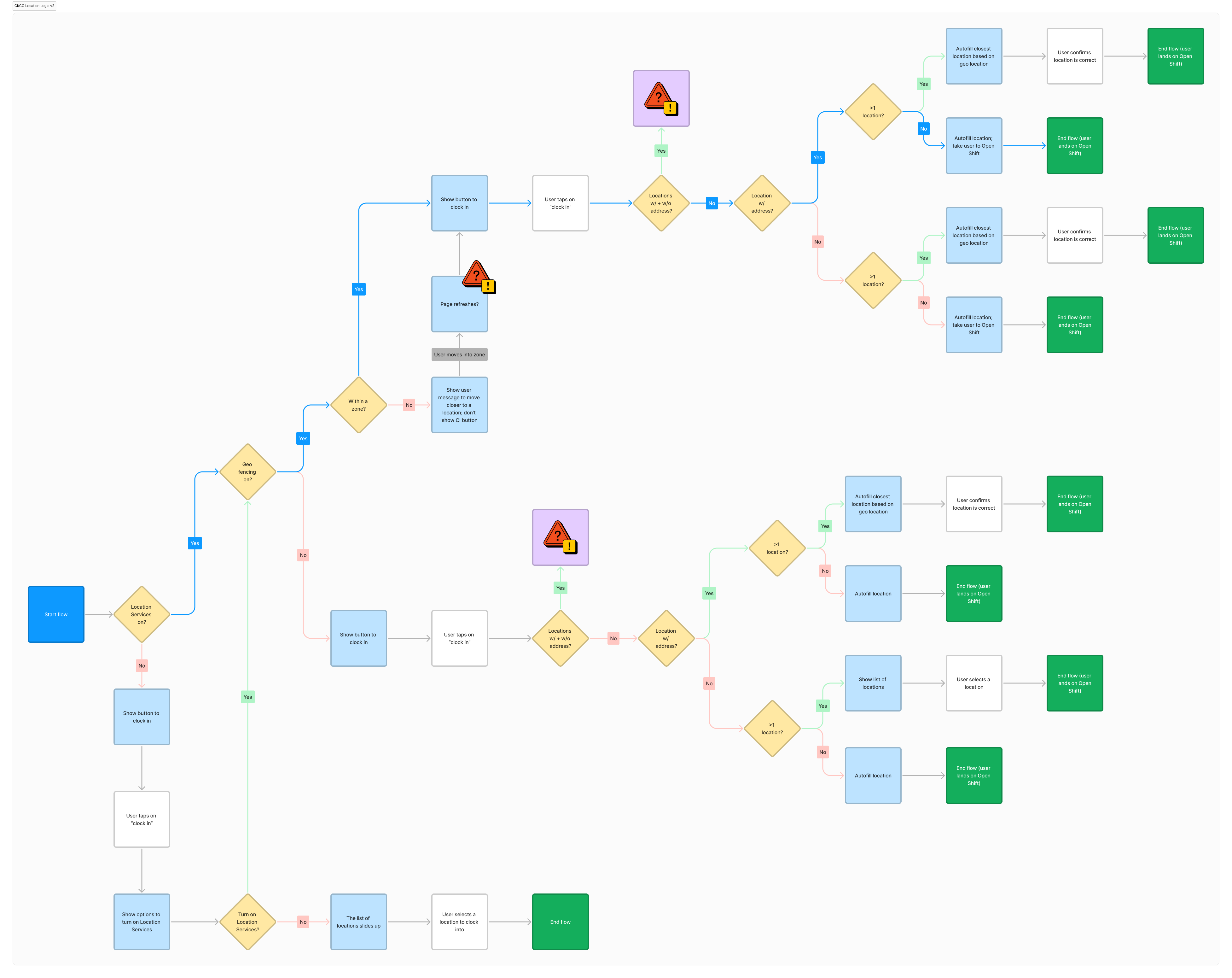
Visualize technical logic
During my audit, I identified an opportunity to streamline the process by using geolocation to autofill the user's location, eliminating the need to manually scroll through a long list. I mapped out the user scenarios and collaborated with engineers to refine the logic and ensure seamless functionality.
Drive data-informed decisions
I leveraged both qualitative and quantitative research methods—including surveys, concept testing, usability studies, and product analytics—to validate design directions and increase confidence in our decisions.

Balance consistency, feasibility and brand expressions
Throughout the project, I worked closely with the Mobile Platform team and the Brand department to align on design constraints and stay updated on the component library’s evolution. Balancing the old and new visual styles was crucial to avoid overwhelming users with frequent changes. I also collaborated with the product manager to sequence design releases, ensuring smooth communication with the product marketing team for customer-facing updates.
Here are some samples of how the designs evolved:


